chainsawriot
Home | About | ArchiveDeveloping the profdr academic theme and musing of 90s homepage design
I am glad that more and more people use static site generators such as Jekyll and Hugo. After using one, I don’t want to go back to Wordpress or something similar.
Comparing Jekyll and Hugo, I think the latter is used more by R programmers due to blogdown. But still I keep using Jekyll. Github as a major player in the Ruby scene nowadays makes Jekyll the default for Gibhub pages. I believe Jekyll still has a great future.
Jekyll theme
I launched the 3rd generation of my Jekyll-powered blog in Sep 2017. When I first used it, it took almost 2 minutes to build the whole blog. But thanks to Ruby 3x3 and various optimization by the Jekyll development team, the building time has been slashed to something like less than 10s.
Since the relaunch, I had used the default minima theme. I think it is a great default theme because I don’t like bells and whistles. Minima is super subtle, no BS, white-background-and-black-text theme. There is actually no need for a change. And then…
“Prof. Dr.” Style
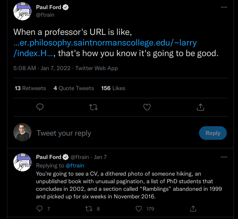
Every now and then, there are academic people or programmers talking about some professors and programmers’ webpages on Twitter. One example is this:

I share the same sentiment sometimes. Old websites bring back the memory of the late 90s, when the world appeared to be less complicated. The late 90s early 00s techno-optimism felt wrong and also good at the same time. Back then, going online — or using my period-appropriate terminology “going up to the net” (Soeng5 Mong5 上網) — was a happy time, albeit the dial-up “capital I” Internet was expensive 1. Also, the telephone rings, the happy time ends.
The URL of my first “homepage” (Do people still use this term now?) also contained a tilde. The web hosting was provided by the ISP. I can’t remember the actual content of my first “homepage”, but I can remember the excitement of writing HTML. I also remember the stupid time when I am so eager to try out HTML tags such as <blink> and <marquee>. The Internet back then was mostly DIY. Internet users, or Netizens (網民), unlike the current connotation of representing some nameless cynics’ opinion, are expressive and creative. In order to express oneself, one needed to learn how to make a “homepage”. It was before the time of Microsoft Frontpage and Macromedia Dreamweaver, not to mention services such as Wix or Jimdo. The only solution was to learn HTML. CSS was not a thing. Arrangement of position was mostly done by <table>. Javascript was super new and mostly used for creating annoying pop-up dialog boxes. Marcomedia Shockwave, the predecessor of Flash, was not popular. Instead, Java applets produced fancy, or sometimes annoying, visual effects. The same went with background midi music.

A random Hong Kong homepage of that era
Web standard has changed many times since then. I don’t think there are many mid- or late-90s web pages left. Well, yes, the original CERN W3 2 is a rare example that time froze in November 1992. Other examples are academic homepages. Olia Lialina wrote about that in her article “Prof. Dr. Style: Top 10 Web Design Styles of 1993”. Some academic homepages keep that late 90s DIY aesthetic. Lialina calls it “Prof. Dr. Style”.

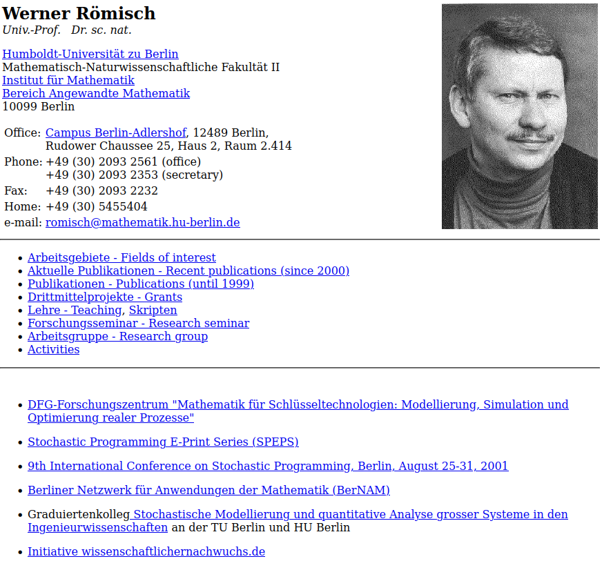
The homepage of Univ.-Prof. Dr. sc. nat. Werner Römisch in the 2000s
The University of Helsinki still keeps Linus Torvalds’s homepage.

The homepage of the late Dennis Ritchie is still online.

Bjarne Stroustrup’s homepage is on his own domain. But it also has the same 90s DIY aesthetic and he still active maintains it.

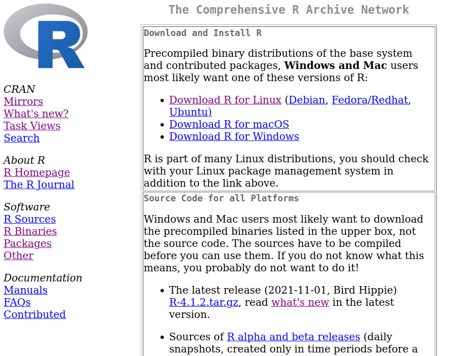
I think one of the most visited website that still has that aesthetic but not about a person is CRAN.

I think the “Prof. Dr. Style” article describes the aesthetic more thoroughly. If I need to describe it, it is brutalistic minimalism.

Wu Chung Multimedia Library, United College, Chinese University of Hong Kong (Source)
If you look at a brutalistic building today, you might feel that is ugly. It’s not decorative and with a bland monochrome color palette. It is basically showing the building materials. But the ugliness also implies practicality. In the end, that’s also minimalistic. But that’s not the contemporary “Marie Kondo” kind of “joy-sparking” neo-spiritualistic minimalism.
I almost sound like a cultural studies professor.
“Prof. Dr.” Style, re-imagined
Let’s go back to Minima. As I said, it’s fine. But it is too modern. The sans-serif typography and super spacious arrangement, for example, are based on the contemporary concept of minimalism. Is it possible to take away even more contemporary elements to make it brutalistic like the 90s DIY aesthetic?
My first attempt is to find a theme. There is actually no short supply of Jekyll themes with that kind of aesthetic. The first one that I’ve come by is No Style please. But it is still quite similar to Minima. The second one is true minimal. And that’s what I want.

This clumsy blog in "true minimal"
But I feel that the theme feels like unfinished. For example, it doesn’t support Jekyll’s relative url system (a key feature for using it in Github Pages) and the syntax highlighting doesn’t work. Functionally, I also come to a regrettable conclusion: The 90s brutalistic style is too brutal to the point that is impractical for a blog.
I tried to read many of my articles in “true minimal” and found it quite not appealing to my eyes. It is like playing video games in the original Game Boy today: the games are fine, even the black-and-white screen is fine too. But in the age of smart phone, the lack of back-light makes it almost unusable. Back then, lack of back-light was okay because most portable screens were without back-light. But now, almost every portable screens have back-light and the ones without are perceived as too dark and be glared easily by any external light source.
Instead of being a dogmatist, I think I rather be a revisionist. I want to keep that brutalistic aesthetic but be functional. The “fix”, using the above Game boy example, is not to fix the game or the dot-matrix black-and-white screen. But to add a back-light. If I need to pretend to be a cultural studies professor once again and inventing more “-ism”s, that’s brutalfuturistic minimalism.
The first issue is the margin. If one doesn’t use any CSS and use pure HTML, there will also be a margin (see the screenshot above). But that margin is too narrow for modern eyes. One would expect a slightly wider margin, but too wide would look like Marie Kondo. After experimentation, I think the best is 2.5% on both sides. Brutal, but natural.
The second issue is the typography. This is a tricky one because the brutalistic aesthetic comes mostly from the bland typography. In the prehistoric world, typography was controlled by — and only by — HTML tags such as <h1>, <h2>, <b>, <i>. The monochrome color palette comes from resisting to change the color. But I think it would be more practical to have a secondary color to display secondary information such as date and author. Without breaking the monochrome color palette, I add a gray color #888888 for that.
The third issue is the browsing devices. In the late 90s, there was only one type of browsing device — computer. Most of the monitors of that period were 14-inch CRT. Some rich folks could afford 17-inch. Nowadays even for a laptop, 14-inch is kind of small. But the main concern is actually those mobile devices. If you do it with the 90s brutalistic HTML, those mobile devices with a small screen won’t work very well. For example, image display can be very tricky.

Image display on my iPhone 6. The image is cut half.
The aesthetic can be brutal, but also needs to be mobile-friendly. I pried open the theme and fixed all three issues. The Liquid templating engine is not that difficult to work with. My previous knowledge in CSS was very useful too.
Introducing profdr
And the end product is the theme I am using now. The theme is aptly called “profdr”.

The theme is responsive
Due to my revisionist approach, I think it is better to make this theme a fork. If you don’t like the revisionist approach, please use the original “true minimal”.
With this theme in my portfolio, I can also claim that I have “extensive” experience in front-end development in my CV. Who doesn’t lie in the CV? If I get fired and my not-so-successful academic career comes to an end, unlike most of the folks to pick a data science position, I can pick full stack developer.
Post Script: the Q & A
Q: Should I use your theme? I am an academic type.
A: No, you shouldn’t. It would not improve your credibility. If you need an academic website, please use either the ubiquitous Jekyll academic pages theme or the equivalent Hugo theme. If you can, develop your own website. My colleague Dr. Rosa Navarrete has an impressive Wordpress-based website. The most impressive of all, in my opinion, is the one of Prof. Dr. Mario Haim. Follow what they are doing, not me.
Q: What are some other features of the theme?
A: It can display source code with correct syntax highlighting.
typedef std::unordered_map<std::string, std::tuple<unsigned int, unsigned int, unsigned int>> puzzlebook;
puzzlebook parse_all(std::vector<std::string> input); // Just the declaration
Also, for academic types, rendering of \(\LaTeX\).
\[\begin{align} y_{ijk} &= \pi_{0} + \epsilon_{ijk} \\ \pi_{0} &= \beta_{00} + \mu_{0j} \\ \beta_{00} &= \gamma_{000} + \mu_{00k} + \gamma_{001} x_{k} \end{align}\]Q: What are the inspirations of the design?
A: I don’t know why you need to know that. But I adopted some design choices from Bjarne Stroustrup’s homepage (the background color) and my long-admired Jacky See’s.
Q: Are you a Prof. Dr.?
A: Not at all. Not even a Juniorprofessor. (Yes, I am not very successful). In Germany, the title “Professor” has a legal definition. Therefore, calling oneself a “Professor Doctor” when he, she or they is just a “Professor” or “Dr”, or not “Professor” and “Dr”, is punishable by law. However, there should be no legal consequences for a non-Prof. Dr. person to use a Jekyll theme called “profdr”.
Q: Are you a cultural studies Professor?
A: No.
Q: Who is Prof. Dr. von Thurn und Taxis?
A: Prof. Dr. em. Ludwig Philipp Maria Joseph Maximilian Lamoral Fürst von Thurn und Taxis is a retired computer science professor at the Universität Tierheim, Switzerland. He has been retired since 1995.
(No, it is a fabricated alter-ego of Dr Chung-hong Chan)
Q: May I hire you?
A: You can try.
 ludwigphilipp dot vonthurnundtaxis at uni-tierheim dot ch
-
Actually, dial-up Internet was not that expensive. In 1996 (the year I started to have access to the Internet), there were only two major ISPs: IMS Netvigator and Hong Kong Star. I used Hong Kong Star at that time. I remember the base rate was something like $128 a month. The expensive part was PNETS, the fee that one needed to pay for using the telephone network (on top of the telephone service). That’s something like $2.5 per hour. ↩
-
It was called W3 internally in CERN, not the current “WWW”. I remember in the late 90s, some cool kids called it “triple W”. It was such a cool time. ↩