chainsawriot
Home | About | ArchiveFonts
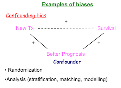
這是上 Master 課時見到的 Powerpoint 幻燈片 。每次見到我都想爆粗。
這是最少出現 Comic Sans 字體的那一張幻燈片。可想而知其他的幻燈片是怎樣的濫用。
不講品味問題,因為好主觀。但我想問在教學時用 Comic Sans 字體是想表達甚麼?可愛?有趣?好玩?特別?
Comic Sans 的設計者在其官網發表了聲明:
Comic Sans was NOT designed as a typeface but as a solution to a problem with the often overlooked part of a computer program's interface, the typeface used to communicate the message.
There was no intention to include the font in other applications other than those designed for children when I designed Comic Sans. The inspiration came at the shock of seeing Times New Roman used in an inappropriate way.
當你見到這個「可愛」字形被濫用,會覺得相當煩厭。另一個被濫用的字形,是華康少女體。今年元朗區區議會的國慶街招居然用少女體寫「中國人民共和國 58 周年紀念」,真是殺人。又回歸原點,用如此字體,又想表達甚麼?可愛?有趣?好玩?特別?
